Non Western Blog Exhibit
Non-Western Blog Exhibit:
Chinese Calligraphy
This week, I really wanted to do Alaskan artist but I decided to go with various Chinese Calligraphy artists. If you don't know what calligraphy it's the art of writing, was the visual art form prized above all others in traditional China. The genres of painting and calligraphy emerged simultaneously, sharing identical tools—namely, brush and ink. Yet calligraphy was revered as a fine art long before painting; indeed, it was not until the Song dynasty, when painting became closely allied with calligraphy in aim, form, and technique, that painting shed its status as a mere craft and joined the higher ranks of the fine arts.
The elevated status of calligraphy reflects the importance of the word in China. This was a culture devoted to the power of the word. From the beginning, emperors asserted their authority for posterity as well as for the present by engraving their own pronouncements on mountainsides and on stone stelea erected at outdoor sites. In pre-modern China, scholars, whose main currency was the written word, came to assume the dominant positions in government, society, and culture.
But in addition to the central role played by the written word in traditional Chinese culture, what makes the written language distinctive is its visual form. Learning how to read and write Chinese is difficult because there is no alphabet or phonetic system. Each written Chinese word is represented by its own unique symbol, a kind of abstract diagram known as a “character,” and so each word must be learned separately through a laborious process of writing and rewriting the character till it has been memorized.
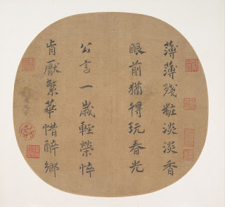
Title: Quatrain on spring’s radiance
Artist: Empress Yang Meizi (Chinese, 1162–1232)
Period: Southern Song dynasty (1127–1279)
Date: early 13th century
Culture: China
The first piece I wanted to do was Quatrain on spring’s radiance. During the Southern Song, artists, and connoisseurs who wished to express their emotional responses to paintings frequently added poems to them; Empress Yang's poems.
Title: Couplet
Artist: Zhao Zhiqian (Chinese, 1829–1884)
Period: Qing dynasty (1644–1911)
Date: dated 1867
Culture: China
The second artist I chose was, Zhao Zhiqian, the leading scholar-artist of his day, who grew up in a merchant family but received a classical education in order to pursue a career in government. Passing the provincial civil service examination in 1859, Zhao spent the next twelve years in Beijing selling his art while trying unsuccessfully to pass the capital examination before being awarded a post as district magistrate in Jiangxi Province in 1872.
Zhao was equally renowned as a calligrapher, seal carver, and painter. He is best known for a distinctive "square-brush" style of calligraphy derived from the engraved stone writings of the Northern Wei dynasty (386–534), as seen in his dedication and signature here, but he also developed a distinctively plump seal-script manner
Title: Biographies of Lian Po and Lin Xiangru
Calligrapher: Huang Tingjian (Chinese, 1045–1105)
Period: Northern Song dynasty (960–1127)
Date: ca. 1095
Culture: China
In conclusion, I chose to go with this tradition that was still going on today because it has so much history and meaning to it. This was a culture devoted to the power of the word, and it really showed. And so, despite its abstract appearance, calligraphy is not an abstract form. Chinese characters are dynamic and closely bound to the forces of nature and the kinesthetic energies of the human body. But these energies are contained within a balanced framework—supported by a strong skeletal structure—whose equilibrium suggests moral rectitude, indeed, that of the writer himself. I would indeed have this in my house because the techniques mean so much and they can be identified by a single sign of a stroke used with the ink.
References:
Barnhart, Richard M. "Chinese Calligraphy: The Inner World of the Brush." Metropolitan Museum of Art Bulletin 30 (April–May 1972), pp. 230–41.
Harrist, Robert E., Jr., and Wen C. Fong. The Embodied Image: Chinese Calligraphy from the John B. Elliott Collection. Princeton: Art Museum, Princeton University, 1999.
Hearn, Maxwell K. How to Read Chinese Paintings. New York: Metropolitan Museum of Art, 2008.


Hello Autumn, I enjoyed reading your post and learning about the history of Chinese calligraphy. It is very beautiful to admire, there is so much rich history within each scroll. I also enjoyed the background story of Huang Tingjian’s transcripts, the ability to record history through written documentation is an amazing feat. Now a days a lot of the population understand how to read and write, but it can be something we take for granted. During past times when not, many could read or write, all messages or accounts were passed by word of mouth/stories, which can easily be manipulated. History is better understood and properly maintained when someone has documented these events, much like Huang did. I would have Chinese calligraphy hanging in my house, it is an amazing form of art. Great post!
ReplyDeleteAutumn,
ReplyDeleteI really enjoyed reading your blog and I loved that you included so much of the history of Chinese calligraphy throughout. I think that all of these calligraphy pieces of art that you showed are beautiful, but I especially loved the second piece. This art by Zhao Zhiqian was especially cool to me because of the boldness of it and how each symbol stands out so well. I am thinking this is because of his "square-brush" technique of calligraphy. I think that it would be so cool to learn how to read this type of writing, but I would love to watch some of these painters and calligraphers at work. I think it is super interesting how each Chinese calligrapher can have such different and unique styles from each other, but all be writing in mostly the same language. It truly is a beautiful style of art.
This comment has been removed by the author.
ReplyDeleteHi Autumn,
ReplyDeleteI liked the calligraphy that you posted. I like that Empress Yang Meizi made her poem look so fancy, by writing it on a circular piece of material that sort of looks like wood. Metmuseum.org (2022) has a translation of the poem, where the poem explains that spring is beautiful, but that the blooming of plants during the spring is quick, and that the plants end up dying just as quickly. I like that the material that the calligraphy was on, was sort of a circle. I like this, because the circle is used to portray continuous movement, which helps me to picture the grass and the flowers during spring, as they are continuously moving back and forth in the breeze of the wind.
I also liked the piece of calligraphy that was completed by Zhao Zhiqian. His calligraphy looks so fancy, as it is made up of thicker lines, which are nice and smooth. Metmuseum.org (2022) explains that the poem translates to say “Great virtue comes from forbearance, sincerity comes from a mind free from deception.” The words are made up of thicker lines, while the papers that he used are rectangles that are used to portray strength. Strength and power can be very similar at times, which is why I believe that the thick lines and rectangles are used to portray power, as there is power and truth to his words.
I am personally not very fond of the style of calligraphy, “Biographies of Lian Po and Lin Xiangru” that was written by the calligrapher Huang Tingjian. I do not like that it looks so messy, and that some of the words are lighter than others, since there were some that were not drawn with as much ink. It is a fun idea though, to write with a little bit of “slope,” where some words are written with more curves to them, or with more jagged lines. This would be a good idea, so it can help the reader to know if they are talking about something that gives the feeling of comfort and ease, or that it gives the feeling turmoil and anxiety.
https://www.metmuseum.org/art/collection/search/40103
https://www.metmuseum.org/art/collection/search/55495
Hi Autumn!
ReplyDeleteI like the topic that you chose for this week's blog. Calligraphy is a unique art that requires drawing with letters. It is sometimes underappreciated, but it is a fun art to learn once you get to do it. People think it's easy, but in reality, it's hard because it takes practice. I tried to do calligraphy with my name in Chinese characters, but it didn't turn out the way I wanted it to. It isn't as easy if you don't have the right tools. Although I know some people that don't require special tools. They are skilled at holding the pen at a proper angle. It is fascinating that Chinese emperors and nobles would use calligraphy to identify themselves, similar to logos of high-end brands of today. The techniques could also be compared to graffiti styles of street artists and their own unique styles. Thank you for sharing!